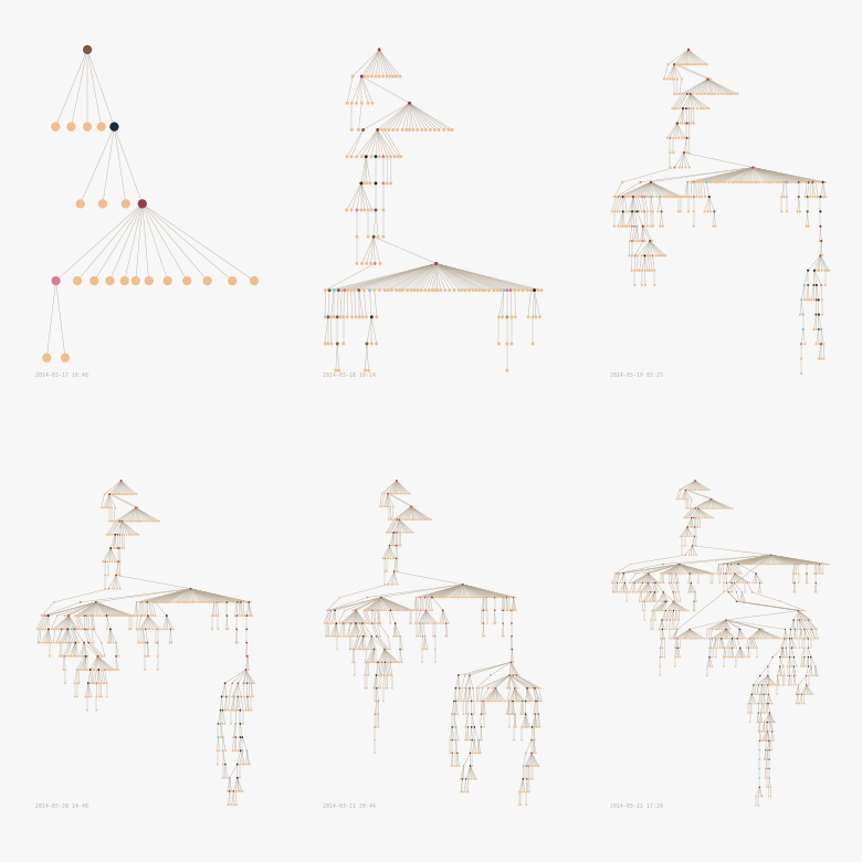
With the wide array of amazing data visualization tools out there – SAP Lumira, Qlik, Domo, Tableau – you would think that the world has moved towards a graphical understanding of reality.

Yet my experience has been that when people are faced with the task of using a fancy new graph or visualization in their work, their first reaction is….to freak out. Now bear with me now. I am not implying that most people can’t handle a nice bar chart or a three dimensional pie chart or even some animated multi-colored craziness.
What I am saying is that most people don’t know where to go from a data visualization. Are they supposed to take a screenshot and send it to their boss? Should they print it out? Should they click the buttons for 10 hours until it gets boring? Should they make a decision?
Ok – ideally they should make a decision. But what if that person is not empowered to make decisions, or if they need to check with their boss first? Also, what if they don’t trust the data behind the graphics? They are taking a pretty big bet when they write that email to the whole department saying “hey this chart shows we should be doing this!”
In a way this is one representation of a phenomena which will become more and more prevalent as computers make recommendations to humans and we have to follow up with the so called “human assist”. That is – the final point in the decision making process.
The visualization can only take you so far, but you need to drink the water.
