
This infographic came from Experts Exchange.
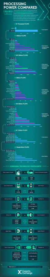
We may (sadly) live in a world devoid of flying cars and personal teleportation devices, but that doesn’t mean technology isn’t moving forward at an incredible pace. We compared the processing power for various computers and devices from 1956 to 2015 to visualize the 1 trillion-fold increase in performance over those six decades. By comparing each processor’s floating operations per second (FLOPS), we avoided any differences in microarchitectures.
Read original article here.
DSC Resources
- Services: Hire a Data Scientist | Search DSC | Classifieds | Find a Job
- Contributors: Post a Blog | Ask a Question
- Follow us: @DataScienceCtrl | @AnalyticBridge
Popular Articles